More than one person has e-mailed me in the past few months asking why I switched away from Octopress—which I was initially so excited about!—to Ghost. Octopress, after all, has a lot of attractive qualities—it can live on Github (though I’ve never bothered with that functionality); you can write blog posts in vim; it uses static pages rather than requiring PHP or Node or something running behind the scenes to generate stuff.
After a year of semi-regular blogging with Octopress, though, I was just kind of…bored with it. The official Octopress blog hasn’t received an update since July 2011, only a few months before I actually started using Octopress myself. Blogging with vim and banging out a static site and pushing it via rsync was cool, but ultimately it just wasn’t as convenient as I’d wanted it to be, and the longer I went between blog entries, the more of Octopress/Jekyll’s liquid tags I’d have to go look up again.
And so…Ghost.
The bad
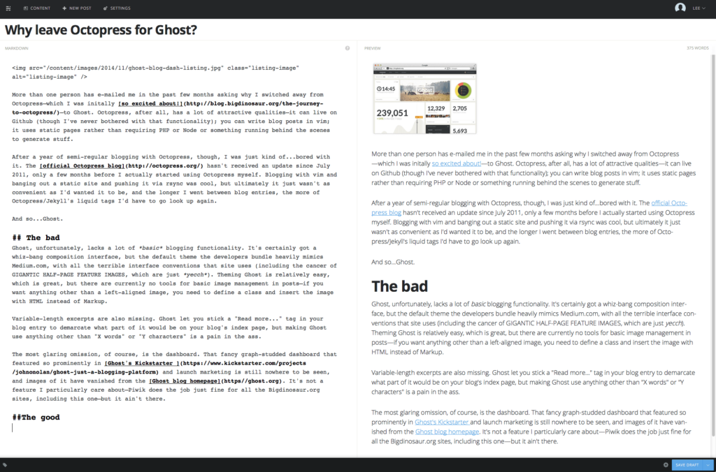
Ghost, unfortunately, lacks a lot of basic blogging functionality. It’s certainly got a whiz-bang composition interface, but the default theme the developers bundle heavily mimics Medium.com, with all the terrible interface conventions that site uses (including the cancer of GIGANTIC HALF-PAGE FEATURE IMAGES, which are just yecch). Theming Ghost is relatively easy, which is great, but there are currently no tools for basic image management in posts—if you want anything other than a left-aligned image, you need to define a class and insert the image with HTML instead of Markup.

Variable-length excerpts are also missing. Ghost let you stick a “Read more…” tag in your blog entry to demarcate what part of it would be on your blog’s index page, but making Ghost use anything other than “X words” or “Y characters” is a pain in the ass.
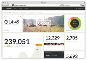
The most glaring omission, of course, is the dashboard. That fancy graph-studded dashboard that featured so prominently in Ghost’s Kickstarter and launch marketing is still nowhere to be seen, and images of it have vanished from the Ghost blog homepage. It’s not a feature I particularly care about—Piwik does the job just fine for all the Bigdinosaur.org sites, including this one—but it ain’t there.
While we’re at it, Ghost is a massive pain in the ass to upgrade if you’re using a customized theme. If you’re sticking with the default “Casper,” the upgrade process only involves copying some files; if you’ve customized the theme at all, then it’s up to you to figure out how to bolt your customizations onto the default theme each time the Ghost folks release an upgrade.
The good
But there are positives, and they more than outweigh the negatives. For one, Ghost isn’t Wordpress. I use Wordpress at work—Ars Technica runs on Wordpress, after all!—but for a tiny personal blog it’s just massive overkill.
That’s a pretty weak positive, I know, but there are more. Ghost is very cache friendly, too—in spite of its dynamic nature, Varnish has no problem hanging onto full cached pages, meaning the site is typically served entirely out of cache to anyone who comes calling. Of course, Octopress did this, too, since it was simply a collection of static files.
I like the fact that Ghost runs on Node.js—it’s new and flashy and not PHP. It means that the Ghost app is neat and responsive and has a cool administrative interface (at least once Ghost grows up) that doesn’t rely on PHP.
Hm. Reading back on the positives, I’m not painting a really rosy picture—it sounds like Ghost is a feature-starved half-programmed wreck of an application that’s a pain in the ass to upgrade. And I suppose that’s true.
